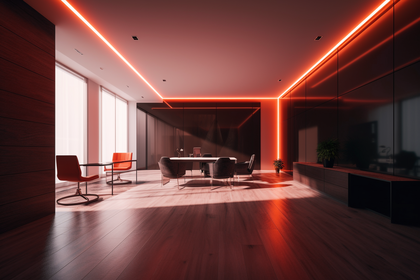
AI generated image of a modern office space
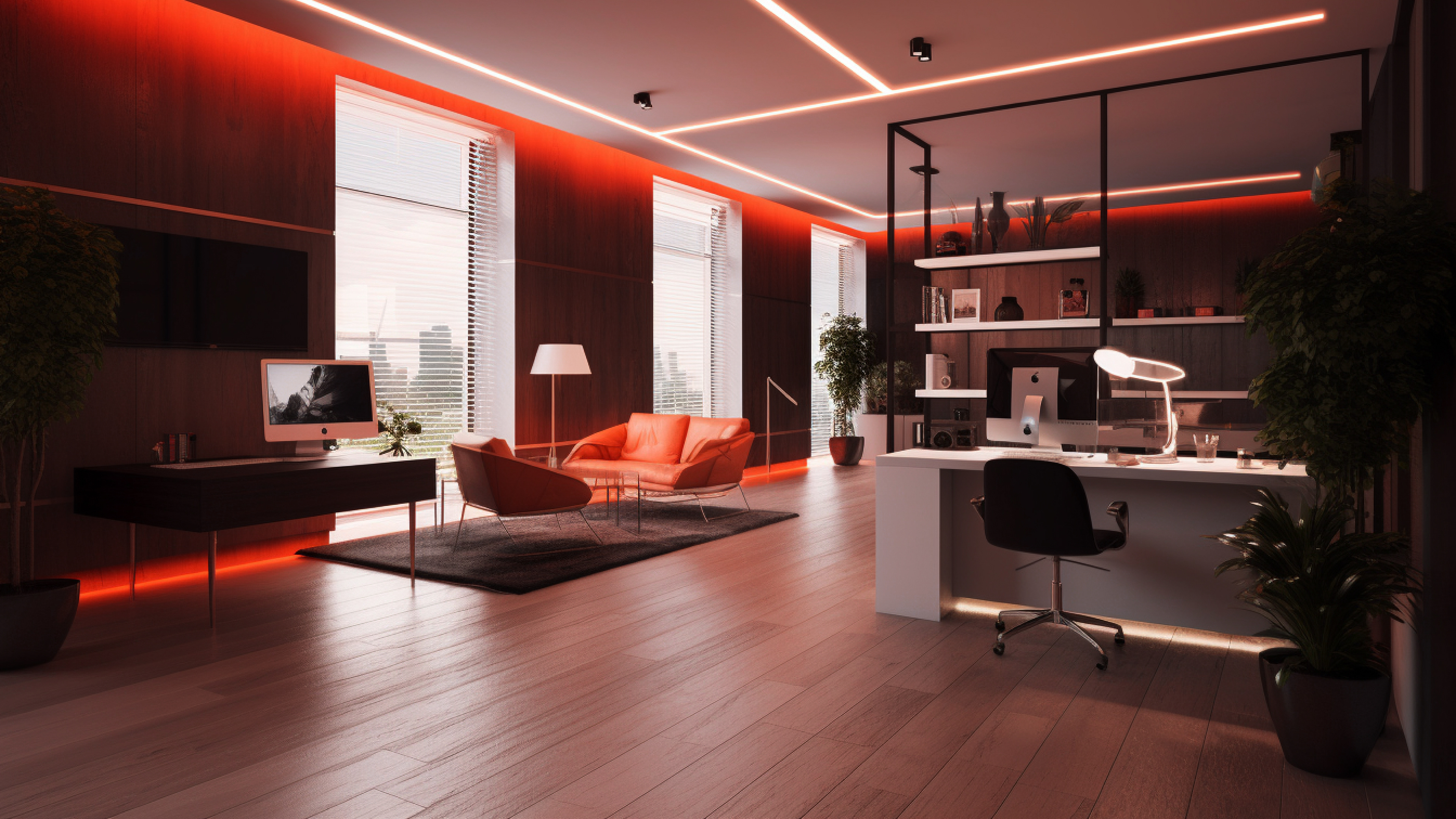
AI generated image of a modern office space
About
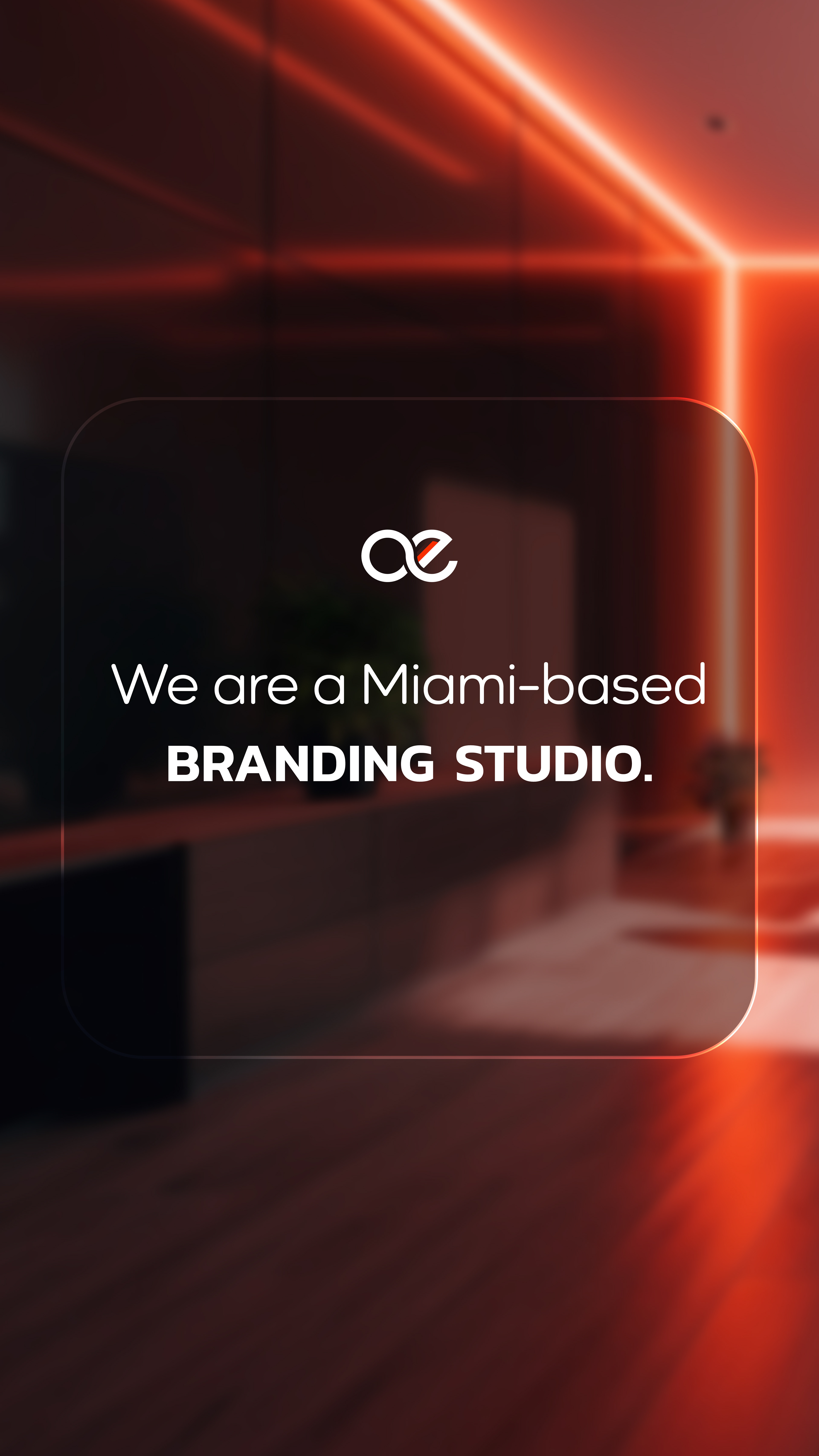
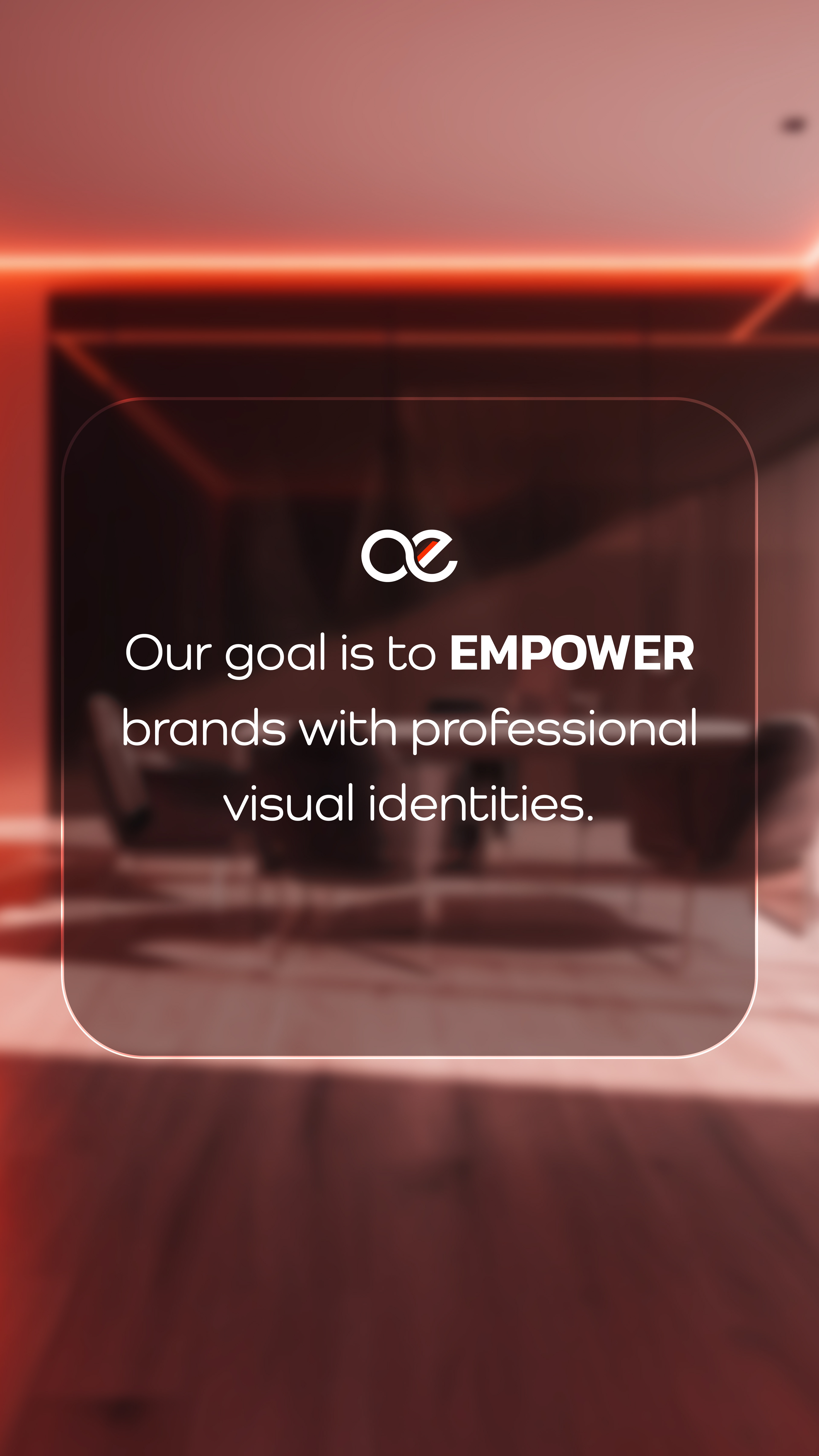
Enphinete is a creative studio based in Miami that aims to empower brands by creating professional visual identities to help them reach their business goals and target the right audience.
Identity and Logo Design Process
The modern characteristics of Enphinete's visual identity project professionalism. Its neutral warm color palette is inviting, and the addition of bright orange inspires optimism, confidence, enthusiasm, warmth, and friendliness. These visual qualities are meant to encourage B2B lead generations.
To further support the brand's visual identity, the logo has to project the same qualities mentioned above: professionalism, modernity, and friendliness. To achieve this, I followed these steps:
step 1: Research & Sketching. I conducted research into the competitive market's branding.
step 2: Experimenting. Based on my research, competitors in the market opt for modern logos. These are geometrical and created using grids. Therefore, I created multiple conceptual versions using the grid technique.
step 3: Finalizing. During this step of the logo design process, I made several changes to perfect the final versions of the logo.
I believe it is necessary to create at least 2 versions of a logo for uses in different contexts. For example, using just the logomark is more appealing in a social media post as it reinforces the brand's identity without tiring the eyes with additional text. In contrast, a combination logo looks better on content meant to establish brand presence, such as a flyer or a website homepage.
Website Design
I designed Enphinete's website using Wordpress. Its design was mainly aimed at mobile users as the main marketing channels are social media apps, such as Instagram. Due to the short attention span that is associated with mobile users, I simplified the content by only creating 3 main pages: About, Contact, Blog) and typed copy that is straight-forward and easy to read. The About page doubles as the landing page, and it includes a brief description of the brand, its services, its strengths, a visualization of the services, and a CTA. The Blog page was added to improve SEO.
Visit the website I created: enphinete.com
Instagram Branding and templates
I also contributed to the studio's visual identity creation for the primary content marketing channel, Instagram. Another marketing channel used by the studio is a blog, where posts include industry related topics. One of Enphinete's goals with this channel is:
1. to attract customers and build trust by creating educational content regarding the design industry (including repurposing blog content)
2. to aid consumers in their journey by posting informative content about the company (leading to the increase of website traffic)
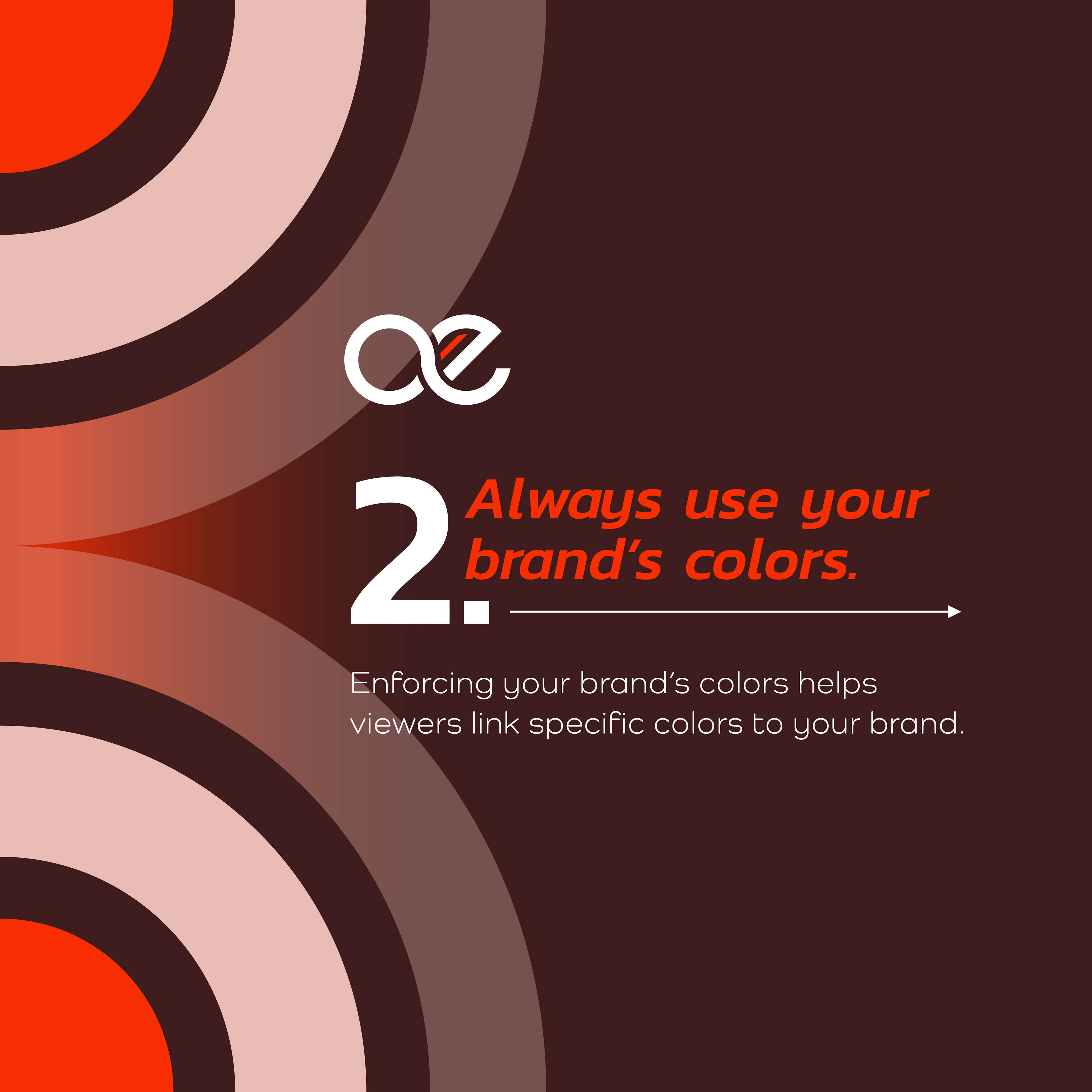
To aid in reaching these goals, I created a carousel template to promote blog posts in a simple, easy-to-read format. I also considered making the profile visually attractive for new users visiting it, and created a layout that is varied but visually pleasing.
