
About
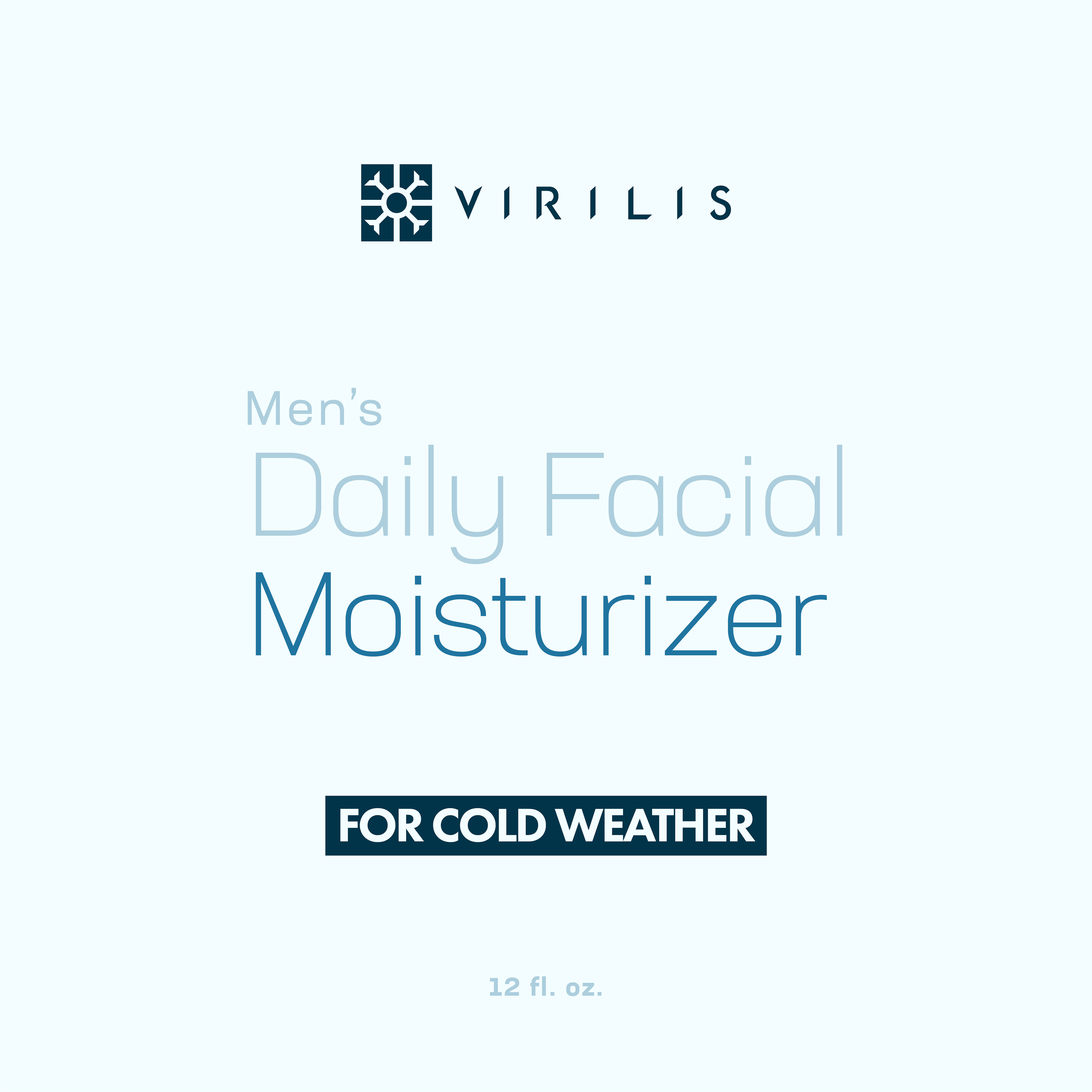
Virilis is a distinguished cosmetics brand tailored exclusively for men, revolutionizing skincare with its innovative marketing approach. Virilis sets itself apart by recognizing the diverse environmental needs of its clientele, offering facial moisturizers based on regional climates. The pioneering advertising strategy distinguishes the brand from competitors.


Logo Design Process
step 1: Conceptualizing. Based on the brand's advertising strategy, I created symbols representing hot and cold temperatures for the logo, based on the physical characteristics of the sun and a snowflake. I wanted the symbols to look similar to maintain visual consistency and be interchangeable when designing packaging.
step 2: Custom Typography. I used the font Futura PT as the foundation for the wordmark, as it has a neutral aesthetic. I modified the letters to appear sharper and customized the letter "R" to resemble the qualities of modern fonts used in the Sports industry.
step 2: Custom Typography. I used the font Futura PT as the foundation for the wordmark, as it has a neutral aesthetic. I modified the letters to appear sharper and customized the letter "R" to resemble the qualities of modern fonts used in the Sports industry.